
Olga Octopus
QTRONIC
24 June 2023
As a 30-year industry leader in electronic solutions for battery-powered vehicles, QTRONIC has long been synonymous with innovation, reliability, and technical expertise. Serving sectors such as internal transport, electric vehicles (EV), recreational boating, agriculture, and road transport, QTRONIC’s position as a developer, importer, and service provider made it a household name in E-control. With a robust commitment to enhancing everyday life through seamless technology, QTRONIC aimed to modernise its brand to reflect a forward-thinking, dynamic image while honoring its legacy of trust and performance.


QTRONIC's brand refresh needed to strike a balance between maintaining brand recognition and showcasing its evolution. The brand identity overhaul included a logo redesign, an updated color scheme, and a comprehensive digital presence through UX/UI enhancements. Our solution prioritized visual clarity, reliability, and alignment with QTRONIC's values, including sustainability and cutting-edge innovation.
We centered our concept around the “Always On” theme, utilizing the universally recognized power symbol to represent QTRONIC's commitment to a reliable, electric future. Positioned creatively, this power symbol mimicked a “Q,” subtly linking to Q-Tronic while symbolizing quality and continuity. At the heart of the design was the “Always On” concept, where the universally recognized on/off button symbol became the defining feature. By rotating the symbol precisely 170 degrees, it formed the shape of a “Q,” seamlessly tying into Q-Tronic’s name and brand identity. This transformation of the power icon symbolized both quality and the brand’s enduring commitment to an electric, sustainable future. The simplicity and familiarity of the on/off button allowed QTRONIC to maintain strong brand recognition while conveying its forward-thinking approach to electronic solutions.

To support this modernised logo, we selected the Outfit font—a geometric yet approachable typeface with multiple weights, promoting readability and flexibility across digital and print media. Outfit’s harmonious design bridges the gap between mechanical structure and humanistic appeal, echoing QTRONIC's brand values of precision and accessibility.

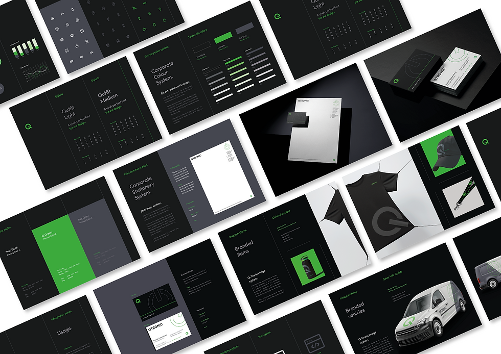


Our UX/UI solution included responsive grid layouts optimised for 16:9 screens and mobile devices, supporting seamless navigation across devices. The updated digital interface reflects QTRONIC's emphasis on reliability and user-friendliness, improving interaction through a clear, consistent structure and a modern visual aesthetic. QTRONIC's brand and UX/UI refresh reinforced its position as a trusted, innovative leader, resonating with existing clients while attracting new audiences. The redesign not only showcased QTRONIC's technical expertise but also strengthened its brand loyalty, aligning with its vision for an electric future.