Olga Octopus
Sony Music
24 June 2023
We were tasked with developing the Olga Octopus brand, including typography and a UX/UI design solution that consistently reflects the musical themes of each album.


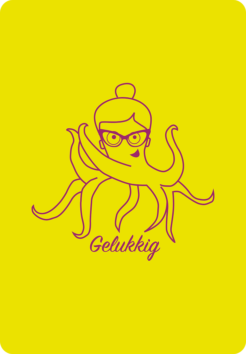


Our approach focused on creating a brand identity that leverages the character’s octopus arms, configuring them in different ways to visually represent and signify the theme of each album. This design solution allowed for a playful and adaptable visual language that remains consistent across various releases.

To ensure Olga is iconic and relatable for children, we crafted a persona that kids would connect with and recognize, prompting them to engage with the content. The goal was to create a character that children would enthusiastically ask for, like saying, “Mama, ik wil de gekke oktopus met de bril luisteren!” (Mom, I want to listen to the funny octopus with the glasses!). This approach ensures that the brand appeals directly to its target audience in a memorable way.


